A diagram made by an agent often looks finished before it is clear. The boxes align, the icons match, and the arrows connect. Yet the model may have added a hierarchy that the prompt never described, made two peers different sizes, or wrapped one concept in several borders because the empty space seemed unfinished.
Those choices are not neutral decoration. A reader assumes that size, position, color, shape, and enclosure mean something. A useful visual grammar gives the agent restrained defaults for decisions the prompt leaves open. The open-source Graphics CLI and Agent Skill turns those defaults into a checked workflow: an authored .diagram.json file produces light and dark SVG and PNG images plus editable tldraw interchange. The rules remain useful without the tool; the tool makes them repeatable.
Treat the prompt as the content boundary
The prompt should define the diagram’s content. An agent can arrange supplied concepts and choose neutral mechanics, but it should not add a sequence, category, legend, callout, or conclusion unless the request calls for one. This constraint matters because a plausible invented relationship is difficult to distinguish from an authored claim once it becomes a clean arrow.
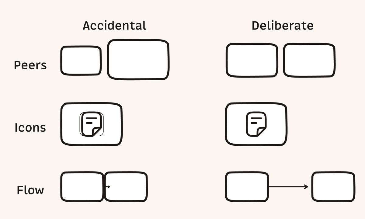
Give semantic peers the same container size, corner treatment, icon scale, stroke, fill, and alignment. A larger box looks more important. A different color looks like a category. A thicker border looks selected. When the ideas are equal, their visual treatment should be equal. When one idea is more important, use one deliberate cue instead of changing every available property.
Give relationships enough room to read
Choose one primary reading direction, then place each next step where the eye already expects to continue. Long arrows make the relationship visible as a relationship; cramped arrows look like gap markers or stray arrowheads. In Graphics’ 1200 by 720 article frame, 120 canvas units of clear space between connected cards is a useful target. Gaps below 96 units usually look crowded. These are house measurements for this format, not universal perceptual constants.
Larkin and Simon’s work on diagrammatic representations explains how spatial arrangement can reduce search and keep the next inference nearby. Purchase’s graph-layout experiment found edge crossings to have the strongest effect among the tested aesthetics, with bends and symmetry carrying smaller effects. The practical order follows: remove crossings first, reduce bends second, and keep the remaining path easy to trace.
Use one border for one group
An outlined icon badge inside an outlined card creates two enclosed regions. If the diagram contains only one concept, the second boundary suggests a grouping that does not exist. Use a bare icon inside the card by default. When the glyph needs contrast, a fill-only plate preserves one outline for one semantic region.
Stephen Palmer’s research on common regions found enclosure to be a strong perceptual grouping cue. That makes whitespace and alignment the first tools for organizing a small diagram. Add another box only when the content contains another group.
Let icons help the label, not replace it
A familiar icon helps a new reader scan, but the short label carries the exact meaning. The paperclip can suggest a source, the book can suggest memory, and the chain can suggest links. None of those glyphs can state the article’s claim by itself. Research on icon identification by Isherwood, McDougall, and Curry found familiarity and semantic distance to be strong factors in recognition.
Use one semantically close icon at a consistent scale and keep the label to a word or short phrase. A shared set such as Hugeicons gives the drawing a coherent stroke language. It does not justify adding icon badges, decorative color families, or different icon sizes to fill the canvas.
Separate evidence from house style
Daniel Moody’s Physics of Notations argues for semiotic clarity, perceptual discriminability, graphic economy, and visual expressiveness. In practical terms, different meanings need distinguishable representations, while repeated meanings should reuse a small visual vocabulary. A diagram spends clarity whenever it introduces a visual exception.
Rounded rectangles are Graphics’ default for bounded concepts because they fit the project’s visual language and are easy to recognize as peers. Bar and Neta found that people preferred curved contours, but aesthetic preference is not proof of better comprehension. A conventional flowchart symbol or an explicitly requested hard corner should override the house style.
Turn the grammar into a repeatable workflow
The @cclrte/graphics package exposes the graphics command and keeps authored content in a checked .diagram.json source. graphics check --strict reports objective layout findings; graphics render atomically refreshes five same-stem outputs: editable .tldr interchange plus light and dark SVG and PNG images. Headless rendering needs neither tldraw Offline nor the tldraw SDK at runtime. The desktop app remains an optional editor for direct canvas work.
The project does not bundle MonoLisa or a large icon library. It defaults to the system sans-serif stack and a small built-in icon set. A local export config can point at font files you have licensed and adapt project-owned SVG geometry from Hugeicons or another set. Font bytes stay out of SVG unless embedding is explicit, so a custom visual language does not have to make the package large.
graphics check can test rules with objective local evidence: equal peer geometry, rounded default containers, sufficient connector runway, and no outlined badge inside an outlined card. The bundled skill carries the judgment a geometry check cannot: follow the prompt without enrichment, use icons as cues rather than claims, and review both themes at reading size. Meaning still needs human review. When a prompt intentionally breaks a default, record a rule-specific reason instead of weakening the check for every future diagram. This is the same scoping discipline described in PRMTE’s guide to agent documentation hygiene.
Review the published image at reading size
A canvas can look orderly at full zoom and fail inside an article column. Check the exported image at the size and theme a reader will use. The review can stay short:
- Does the picture say only what the prompt supplied?
- Do equal ideas look equal?
- Is the first relationship easy to find and follow?
- Does every border create a real group?
- Do the labels and icons remain legible in light and dark?
When these decisions should survive the current task, keep the visual grammar in the Agent Skill, preserve the .diagram.json source beside its replaceable exports, and pair a knowledge-base diagram with a note. A durable knowledge base for coding agents gives those rules a place to be reviewed, linked, and improved instead of rediscovered in the next prompt.